
The Fourways brief: clear promotion on the move
The client was a catering business based in Fourways, serving corporate lunches, private functions and weekend events across Johannesburg. Their van was already doing the miles, but it was not pulling its weight as a marketing tool, especially when parked outside venues or moving through busy areas like Sandton, Bryanston and Randburg.
The brief was simple enough on paper: make the van look professional, appetising and easy to recognise at a glance. The owner wanted food service graphics that would attract attention during deliveries and events, while still looking tidy enough for premium clients. The wrap had to suit a working vehicle, not just a photoshoot. It also needed to hold up to sun, dust, washing and constant loading and unloading.
- Client type: catering and event food service business
- Area served: Fourways and surrounding Johannesburg suburbs
- Vehicle use: daily deliveries, event transport and client-facing parking
- Goal: stronger brand visibility and a cleaner, more professional finish
What we had to work around on the vehicle
Before any print work started, we checked the van closely. Commercial vehicles often arrive with small dents, stone chips, old adhesive marks and panel differences from side to side. This one had a few of those usual issues, plus heavy handling around the rear doors and loading area. In food service, the vehicle is part of the business image, so any rough patch shows quickly.
We also had to plan for a mixed-use van. It was not only driving between kitchens and venues, it was often parked for several hours at a time while staff loaded trays, gas bottles and serving equipment. That meant the graphics needed to stay readable when the doors were open, and the finish needed to stay neat around handles, hinges and panel breaks. The team in Kya Sand checked the body lines and mapped out the placement so the key message would not be cut off in the wrong places.
- Surface condition checked before installation
- Panel layout measured for side doors, rear doors and wheel arch areas
- Graphics positioned for visibility with doors open and closed
- Finish planned for frequent washing and direct sun
Artwork and production for a food service van
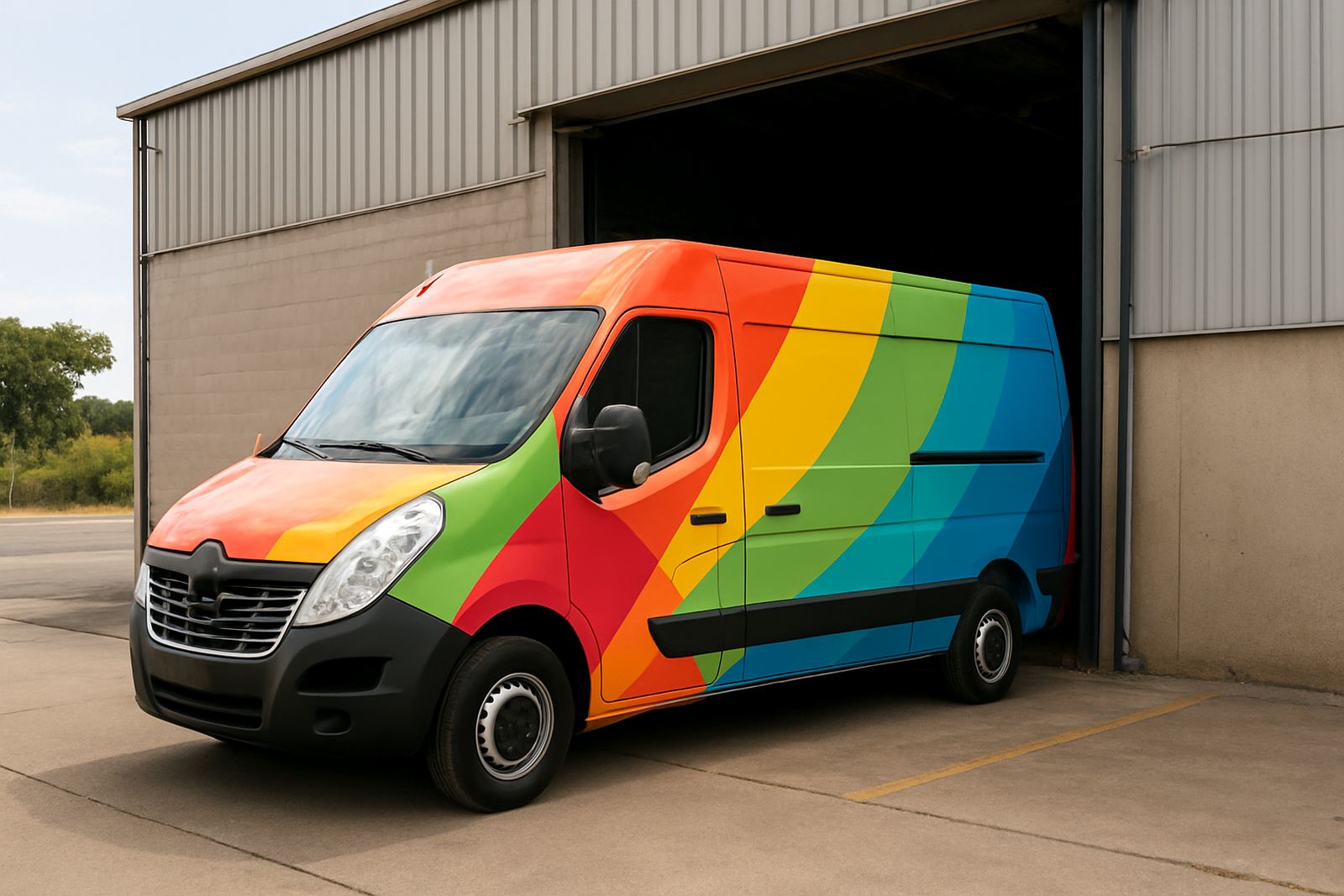
Candice Petersen led the artwork and production side, with a layout built around bold food service branding rather than cluttered decoration. The design used strong colour blocks, clear wording and large contact details so the van could be identified quickly in traffic. We kept the information hierarchy practical: business name first, then service message, then contact detail. No unnecessary noise.
The print set included wrap panels for the main sides, rear door graphics and smaller detail sections around edges and fittings. Where the vehicle shape needed it, we allowed for panel overlaps and safe margins so nothing important disappeared into a seam. The vinyl was printed, laminated and prepped in-house before fitting. For a vehicle that spends time in the sun and gets washed often, that extra protection matters. It helps the colours stay cleaner for longer and makes the surface easier to wipe down after a muddy event site or a wet winter delivery run. We also made sure the artwork still read well from 10 to 15 metres away, which is often the distance that counts most in real traffic.
The client asked for something that felt busy in the right way, without looking messy. That balance is tricky with catering vehicles because there is often a lot to say. We kept it tight and functional. The result had enough movement to catch the eye, but still looked ordered when the van was parked next to guest cars or company shuttles.
Installation in Kya Sand, completed over two weeks
The project ran over two weeks from final artwork approval to handover. Week one covered measurement, artwork adjustments and print production. Week two covered vehicle prep, wrap fitting, final trimming and quality checks. The van came through our Johannesburg base in Kya Sand, where the team handled the fitting in a controlled bay to reduce dust and keep the edges clean.
Johan van Wyk handled the fitting work, with support from Onalenna Sekhukhune on scheduling and production flow. The install included careful cleaning, surface prep and fitment around the body contours. On a catering van, those details matter because food clients tend to notice cleanliness fast. We paid extra attention to the rear because that is the area people see most often during deliveries and pick ups.
- Timeline: 2 weeks from approval to handover
- Installation base: Kya Sand, Johannesburg
- Fitment focus: clean seams, readable rear panel, neat door edges
- Support team: production, fitting and final inspection
Why the final finish worked for event use
The finished van now reads clearly whether it is in a driveway, outside a banquet hall or moving through traffic in Fourways and the wider northern suburbs. That matters because catering businesses do not just sell food. They sell confidence. The van now gives that confidence before anyone even opens the back doors.
The owner wanted a vehicle that would look good at high-profile events but still hold up to everyday use. The wrap achieved that by combining strong branding with practical protection on the painted panels. It also made the van easier to maintain. When a catering vehicle is used around load-shedding generator setups, dusty venues or coastal humidity on out-of-town work, a well-finished wrap helps the bodywork stay cleaner and reduces the look of wear. The client reported that guests and venue staff started recognising the van much faster, which helped at busy arrivals where multiple suppliers were parked in the same area. A small thing maybe, but it saves time on site and improves the impression at first glance.
Details we'd keep on another catering van wrap
For another catering van, we would use the same approach: keep the message direct, allow for door movement, and design for the way the vehicle is actually used. The best result comes from planning around parking, loading and road visibility rather than trying to fill every panel with detail. We would also keep the rear branding especially strong because that is where most clients and suppliers catch the vehicle from a short distance.
If the business adds more vehicles later, the same colour balance and type treatment can be carried across the fleet so every van looks part of the same operation. That kind of consistency is useful for bigger event work where different vehicles arrive at different times. It also supports staff confidence. When a driver turns up in a van that looks properly sorted, clients notice the differnce straight away.
- Keep the key message short and readable
- Design around real loading and unloading patterns
- Use durable print and lamination for frequent washing
- Carry the same layout across a fleet for consistency
Key facts
| Project | Fourways Catering Van |
|---|---|
| Client type | Catering and event food service business |
| Location | Fourways, Johannesburg |
| Timeline | 2 weeks from approval to handover |
| Service scope | Artwork, print production, installation and aftercare |
| Primary outcome | Bold food service graphics with stronger on-road visibility |