Why distance matters more than the mock-up
Most wrap jobs are judged too close. A design can look busy and impressive on a computer screen, then fall apart the moment it is seen from 15 metres away or while moving at traffic speed. That is where distance design comes in. The aim is simple: the public must understand who you are, what you do and how to reach you without having to stare.
In Johannesburg, that matters because vehicles are seen fast and often in poor light. Morning traffic, hail-light reflections, tinted glass and dirt from summer rain all reduce legibility. A van in Sandton may be passed in seconds, while a fleet ute in Midrand might be read from the pavement or from an office block parking bay. Good wrap design works in all of those moments.
- Large, high-contrast lettering reads better than thin script.
- One strong message beats four small messages.
- Clear spacing helps when the vehicle is seen at an angle.
Start with the side view, not the full artwork
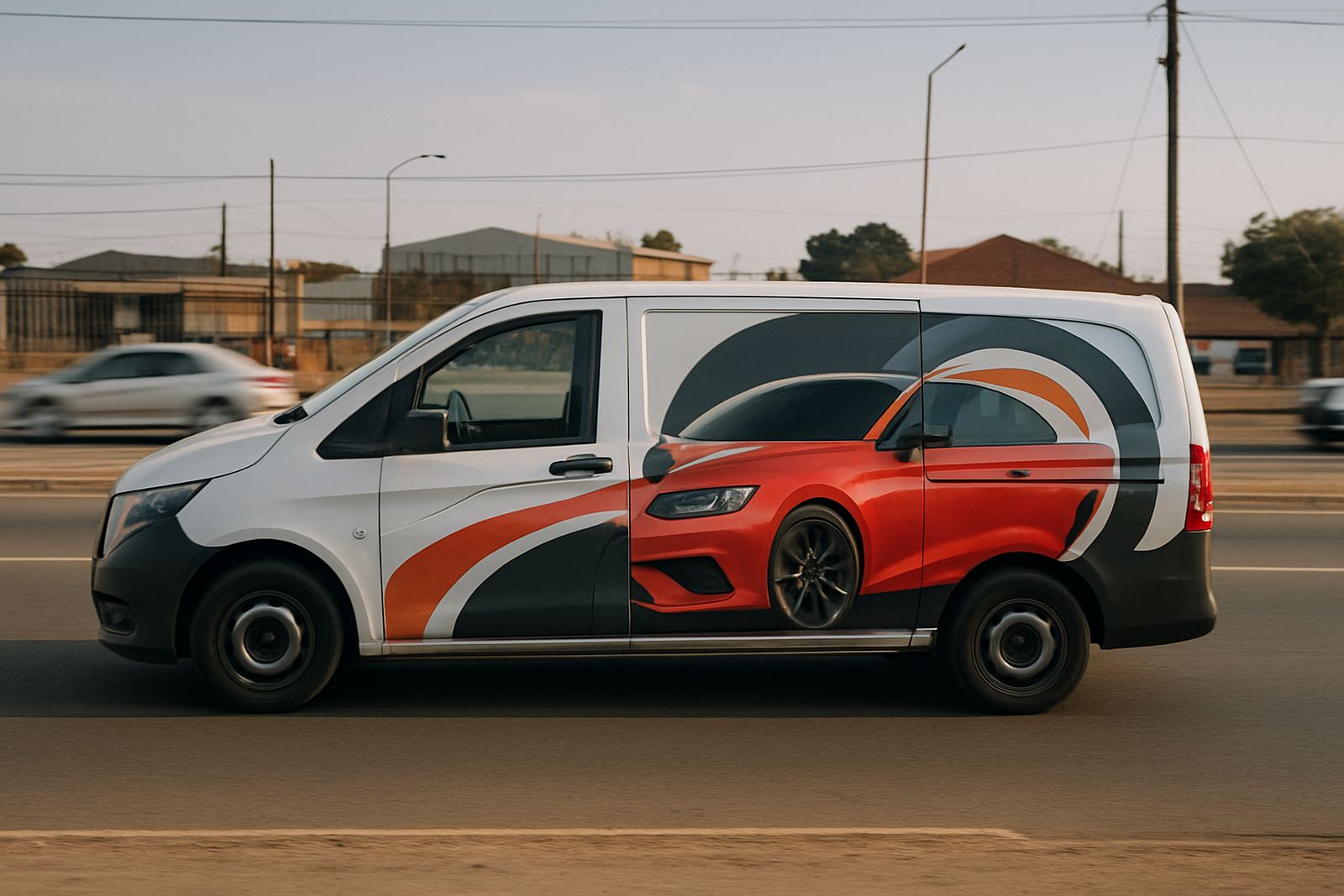
The side panel is usually the main advertising face, especially on vans, panel vans and SUVs. That is where the eye lands first. Start the layout there and build the rest of the vehicle around it. If the side message works, the bonnet, rear door and tailgate can support it without fighting for attention.
For a fleet, the same rule applies across every vehicle. Keep the logo position, contact details and colour blocks consistent, even if the body shapes differ. That gives your business a proper road presence and helps customers recognise the same company vehicle again in a parking lot or at a site gate.
- Place the logo where body lines do not cut through it.
- Keep phone numbers large enough to read from a moving car.
- Use fewer words on smaller vehicles and let the graphics do some of the work.
Before anything goes to print, our design team and production lead usually test how the layout will sit on the actual panel shapes. That avoids awkward text breaks and tiny details that get lost once the vehicle is wrapped.
Colour contrast beats clever detail
Strong design is not about cramming in every brand colour, gradient and icon. It is about contrast. Dark text on a pale background, or pale text on a dark panel, gives the cleanest read. If your brand colours are both mid-tone, the wrap may need a white field, black border or a solid accent panel to make the message stand out.
This matters even more in South Africa where vehicles are often dusty and parked outdoors. A wrap near Kya Sand or on a construction route in the East Rand can pick up grime quickly. A design that relies on fine detail will fade visually once the vehicle is not freshly cleaned. A simpler scheme keeps working longer between washes, and that saves time for fleet teams too.
- Choose one dominant colour and one support colour for the main message.
- Reserve busy patterns for smaller sections, not the whole vehicle.
- Avoid placing critical text over wheel arches, fuel caps or heavy curves.
What drivers see first on moving traffic
When traffic is moving, people do not read in a tidy top to bottom order. They catch the largest shape first, then the logo, then one or two words. That is why a wrap should be planned for a three second glance. If a commuter in Pretoria or Durban can understand the company in that time, the design is doing its job.
The rear of the vehicle is also important. In traffic, a tailgate or back doors often get more attention than the side panel. For couriers, service vans and field teams, the rear should carry the clearest version of the company name, website and phone number. Keep decorative elements lighter there so the practical details stay readable.
- Fronts should stay simple, with enough branding to identify the vehicle quickly.
- Sides can carry more visual weight, but still need breathing room.
- Rears should prioritise contact details and a clear call to action.
If your team works across several branches, consistency is key. A Kya Sand base vehicle should still look like part of the same fleet as one operating in Midrand or Durban. That is where Fleet Brand Standard work pays off. It keeps the brand neat, even when vehicles differ in model, year or fitout.
Local conditions change how a wrap should be drawn
Johannesburg sun, coastal humidity and long highway runs each place different demands on a design. Bright sun can flatten pale graphics. Coastal moisture can make it more important to avoid tiny lettering that may look muddy over time. Heavy use, frequent washing and parking under trees all affect how the finished vehicle appears.
That is why a practical wrap design also considers surface preparation, material placement and aftercare. A vehicle used in Sandton office parks has different needs from a courier van working between warehouses in Kya Sand and Pretoria. The same goes for a branded ute that loads tools every day. It must be designed for use, not just for photographs.
- Use bold, durable layouts for fleet vehicles that rack up kilometres.
- Allow for dirt and wear near door handles, lower panels and load areas.
- Plan around legal tint limits and visibility for side and rear windows.
A practical Johannesburg example
Think of a plumbing company running three bakkies between Kya Sand, Midrand and the East Rand. The owner wants the vehicles to look professional, but the message must still be seen when one bakkie is parked outside a client’s gate and another is driving through peak traffic. The best design would use a clear logo on both doors, a short service line such as emergency repairs and maintenance, then one phone number large enough to read without strain.
Instead of filling every panel with tools, tap patterns and multiple slogans, the wrap should use the vehicle shape to carry the brand. A solid side block, a rear contact panel and a small bonnet mark are often enough. That approach looks cleaner, costs less to keep tidy and gives the fleet better recall on the road.
For companies with mixed vehicles, the same logic still applies. A hatchback, panel van and bakkie can all share the same visual language if the layout is designed around distance, not around one perfect body style.
Final checks before print and fitment
Before a wrap goes to production, the design should be checked at full size, not only on a screen. Text that looks fine at 100 percent can disappear once applied to a curved door or rear quarter. Good proofing catches that early. It also gives time to confirm spelling, spacing, contact numbers and any municipal or site-specific wording that needs to stay exact.
The best results usually come when the design stage is treated as part of the business message. Clear artwork, proper preparation and careful installation all support the same goal: a vehicle that works hard on the road and still reads well from distance.
- Check the design from 10 to 20 metres away before approving it.
- View it in daylight and again in shade if possible.
- Make sure the rear contact details can be read by the car behind you.