
Why the eye reads simple wraps faster
On a busy Johannesburg road, people do not have time to study a vehicle from bumper to bumper. They catch a logo, a company name, maybe one service line and a phone number if the layout is clear. That is why simple graphics often do better than a wrap packed with too many colours, photos and slogans. The message lands before the vehicle moves on.
For fleet owners, that matters. A cleaner layout is easier to read from 10 to 30 metres away, which is the real viewing distance for most work vehciles in traffic, parking bays and loading areas. When the branding is tidy, the business looks organised too, which can help when a client is deciding who to call.
What belongs on the side panel
A side panel is not a brochure. It should carry only the details that matter when someone sees the vehicle once and moves on. The best wraps usually keep the message tight and direct. If you try to say everything, the result becomes cluttered and the main point gets lost.
- Business name in a strong, legible typeface
- One clear service line, such as plumbing, deliveries or property care
- Phone number or message, not five contact options
- Website or suburb coverage if it helps local calls
- Logo used at a size that still reads in traffic
In Kya Sand and across the Randburg routes, we often see bakkies and panel vans that only need three things to work hard for the business: a name, a number and a single promise about what the company does. That is enough when the layout is balanced.
Colour change does not need to shout
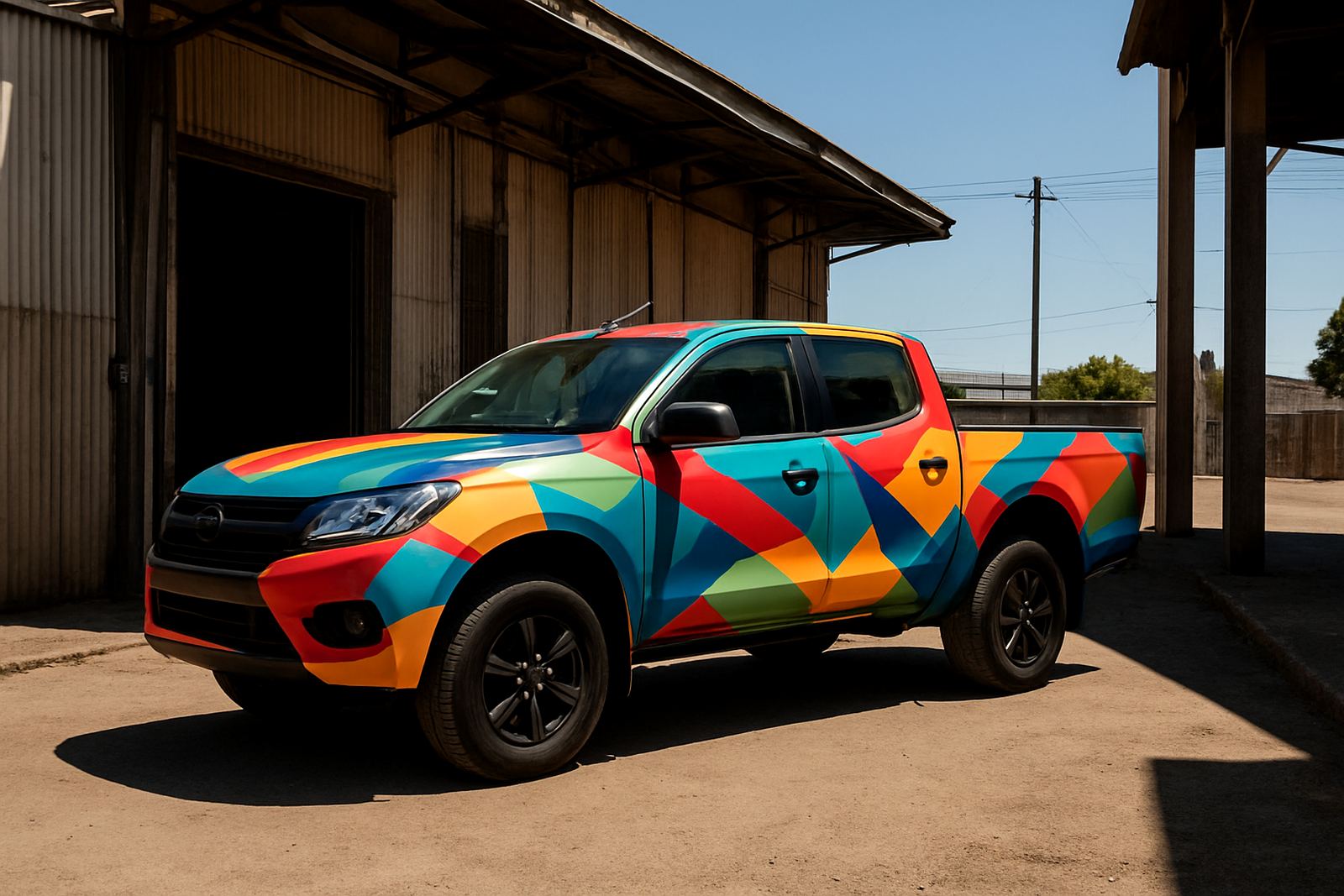
Vinyl colour changes can make a vehicle look fresh, but louder is not always better. A strong solid colour with a neat logo often does more for a business than a busy mix of gradients and patterned panels. On fleet vehicles, a consistent colour across all units helps the team look joined up even if the vehicles are different makes and sizes.
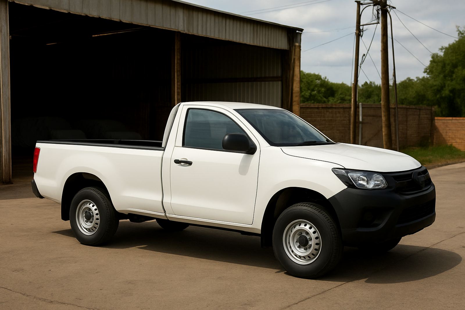
In South African conditions, practical choices also matter. Dark finishes can show dust and coastal salt sooner, while lighter colours may stay cleaner looking for longer between washes. If the fleet spends time in sand, construction areas or near the coast, the wrap should be planned around real use not just a photo on a screen.
Keep the message readable in traffic
A good wrap should be understood in a glance. That means spacing, contrast and scale matter more than extra decoration. A white logo on a dark side panel may look neat on paper, but if the font is too thin it can disappear at speed. Big enough letters, proper contrast and a sensible layout are what make the difference.
For companies that run between Sandton, Midrand and the East Rand, traffic gives you repeated exposure. The same vehicle may be seen at a robot, in a queue at a site entrance and again on the N1. A simple message gives people a second chance to remember you, which is often where enquiries start.
- Use one main focal point per side
- Keep key text away from door handles and body lines
- Make sure fleet numbers do not fight with the brand name
- Leave breathing room around the logo so it stands out
A local fleet example from Johannesburg
Consider a small fleet of five delivery vans working out of Kya Sand with daily runs into Sandton and Pretoria. If each van carries a different layout, the business can look patchy and hard to remember. But if the fleet uses a simple standard with the same colours, same logo placement and the same phone number on every unit, the whole operation feels more settled.
That consistency also helps with replacement vehicles and new additions. When one van is off the road and a backup unit comes in, the wrap can still fit the standard without needing a fresh design every time. It saves time during busy periods and keeps the brand looking like one business, not a mix of random vehciles from different years.
For businesses that work through load-shedding schedules or shift changes, that cleaner standard also helps staff. Drivers know where to park, how to keep the vehicle presentable and what the public should see first.
Protection and finish should support the brand
Simple graphics do not mean less care. It means the finish has to be precise. Surface preparation, panel cleaning and correct installation all affect how the wrap looks after a few months of sun, rain and regular washing. If the edges lift or the vinyl is cut badly, even a neat layout starts to look tired quickly.
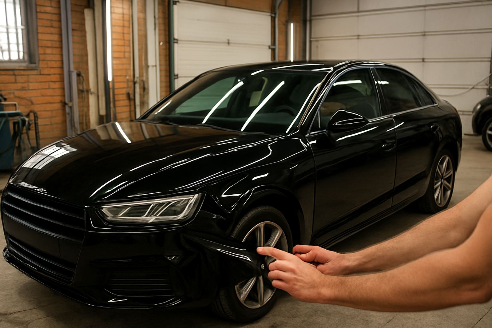
Many owners now combine branding with paint-protection film, tinting or interior restyling on higher-value vehicles. That makes sense when the same unit is used for business and client visits. A wrap should protect as well as advertise, especially on vehicles that spend long hours outside in hot parking areas or near coastal humidity.
- Check that door edges and handles are finished neatly
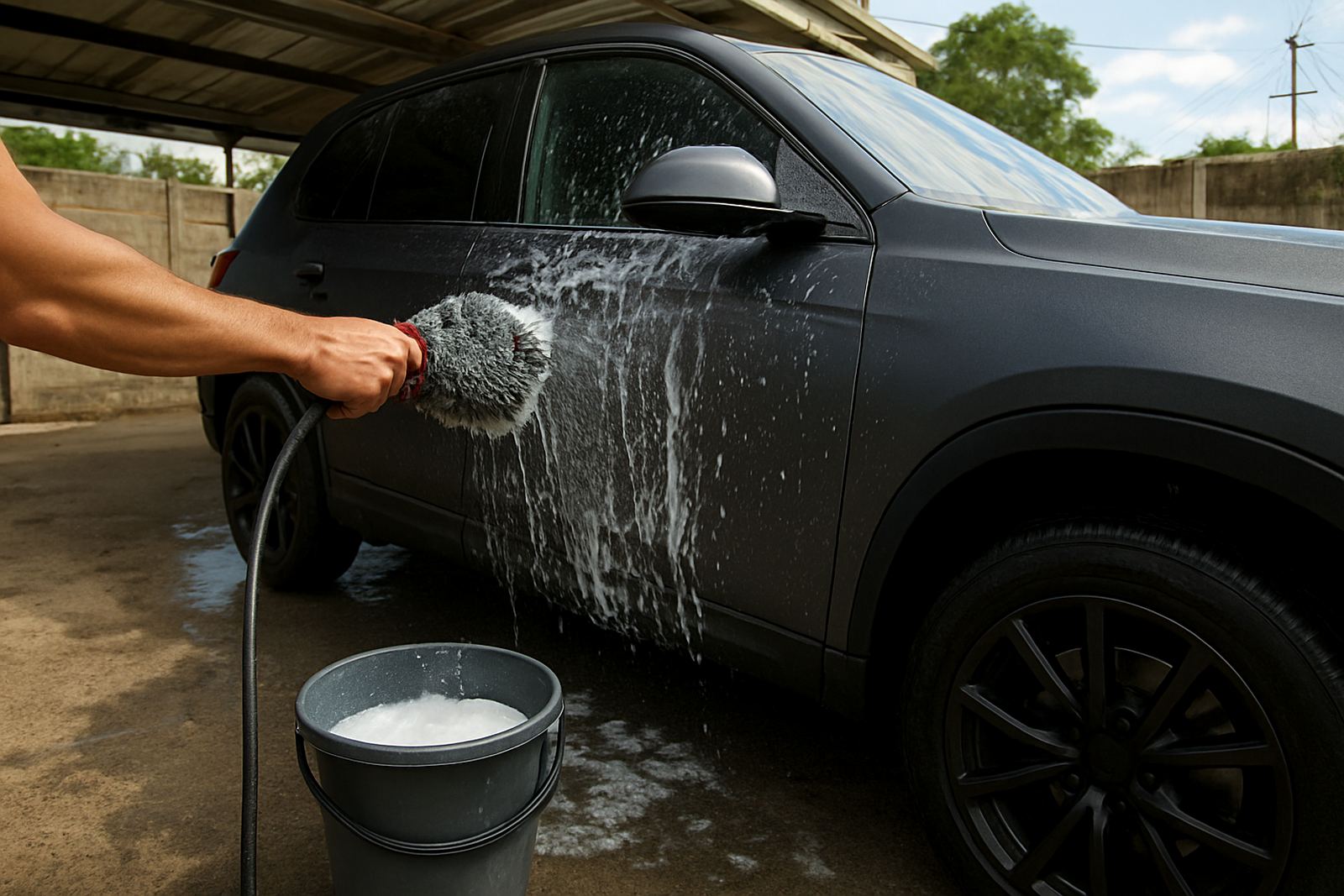
- Ask how the wrap will handle frequent washing
- Keep aftercare simple for drivers and site teams
- Plan for wrap removal if lease terms or fleet cycles change
When less really does mean more
The strongest vehicle branding is often the easiest to understand. A clear logo, one service message and good placement can carry a business further than a crowded layout with too many claims. People remember what they can read quickly. They rarely remember what takes effort to figure out.
For Johannesburg businesses, especially those with active fleets in Kya Sand, Sandton, Midrand, Pretoria, Durban and the East Rand, the aim is not to turn every vehicle into a poster. It is to make each one a moving signboard that looks organised, stays legible and supports the company day after day. Cleaner branding does that job without noise.